 ISO 400, aperture f/8, shutter speed 1/640 I took a photo of this longhorn for Balance because if split it down the middle, both sides of will be almost symmetrical and have balance representing the equality of both sides. I believe this photo is successful because it gives a good example of balance and equality on both sides of the photo if it was split down the middle. 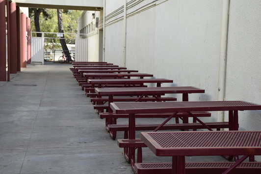 ISO 400, aperture f/8, shutter speed 1/400 I used this photo for Rhythm because the continuous line of tables has its own Rhythm of the same size and angle. They're all placed against the wall and all the same size going in the same direction. 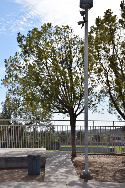 ISO 400, aperture f/8, shutter speed 1/2500 I took this photo of the trash can and the light pole for Proportion because it shows the huge difference in height and size. The trash can is short and wide, and the light pole is very tall and skinny. It really makes the difference between them in an obvious way. 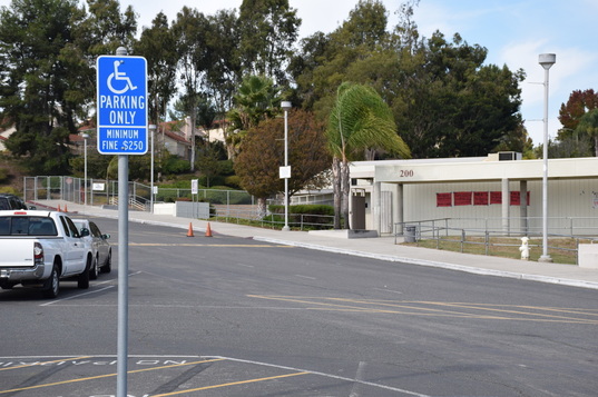 ISO 400, aperture f/9, shutter speed 1/640 I used this photo for Emphasis because the first thing you notice when you look at the photo is the handicap parking only sign because of it's bright blue color that really pops and attracts the eye. 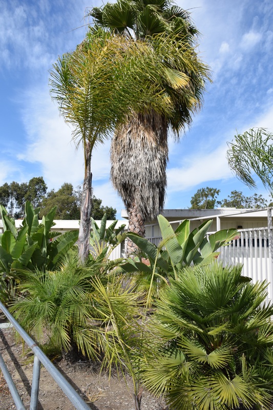 ISO 400, aperture f/8, shutter speed 1/800 I used this photo for Harmony because of all the different types of plants and how they're all a bright green color. all of their different shades of green give it a harmonious feeling and attract the viewers eyes. 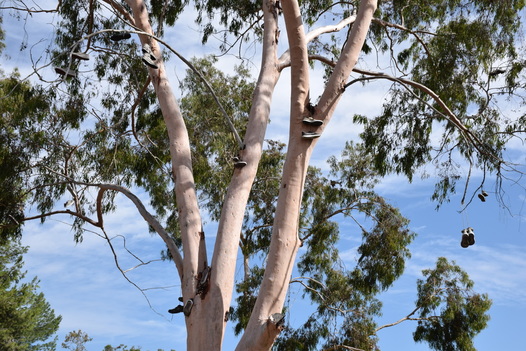 ISO 400, aperture f/8, shutter speed 1/800 I chose this photo for Variety because of all the different shoes hanging from the tree. They're all different types of shapes, colors, and sizes and show a variety of different types of people that threw them up there to hang from the tree. 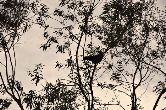 ISO 400, aperture f/8, shutter speed 1/2000 I chose this photo for Unity because of the cool shot of the bird sitting up on a branch in the tall tree with the gloomy clouds in the background making the photo almost look as though it's in black and white.
0 Comments
Leave a Reply. |
AuthorArchives
May 2017
Categories |
 RSS Feed
