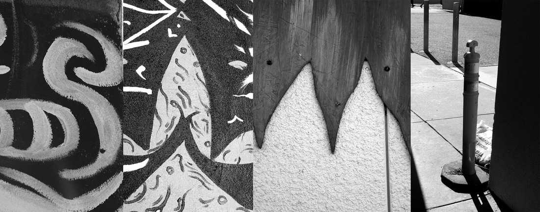
 Because my Name (Sam) is only three letters, I added an i on the end to be Sami, a name that my friends call me sometimes. First, I went outside with my partner to take pictures, then when i came back, I opened the Name-4-photo-template.psd in photoshop, then I dragged my first photo of an S to the first box to add it to the line up of photos, then I continued that step with my other three photos of my letters. Then I merged the layers and saved it and named it sam-maddox-nameproject.psd. I did have some trouble finding the letter M outside when I was searching for letters. I guess I'm pretty proud of the M that I found in the wooden mural by the girls bathroom. I think the best thing about my artwork is that I was able to find most of my letters were in the murals around the school. I think that I could have found something a little more challenging for the letter I.
0 Comments
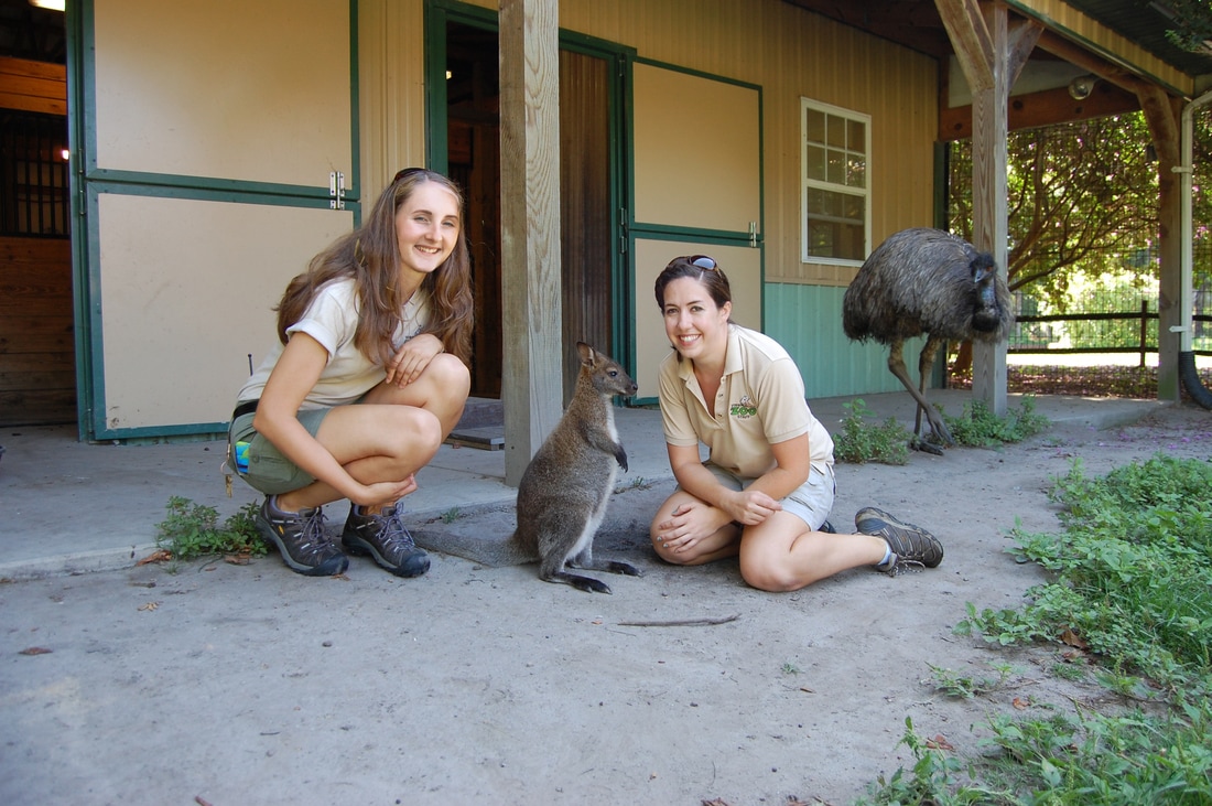 My name is Samantha Maddox and I am an exotic animal psycologist and I live on an animal reservation in Southern Africa. I went to Moorpark college in LA for 4 years to get my bachelors degree in Animal psychology and behavior. Then I transferred to The Southern African Wildlife college to further my knowledge of animal behavior of african animals and to train to become a ranger to protect the elephants of Africa from poachers who are killing them for their ivory tusks. I also have two children I adopted from an African orphanage to give them a better life. 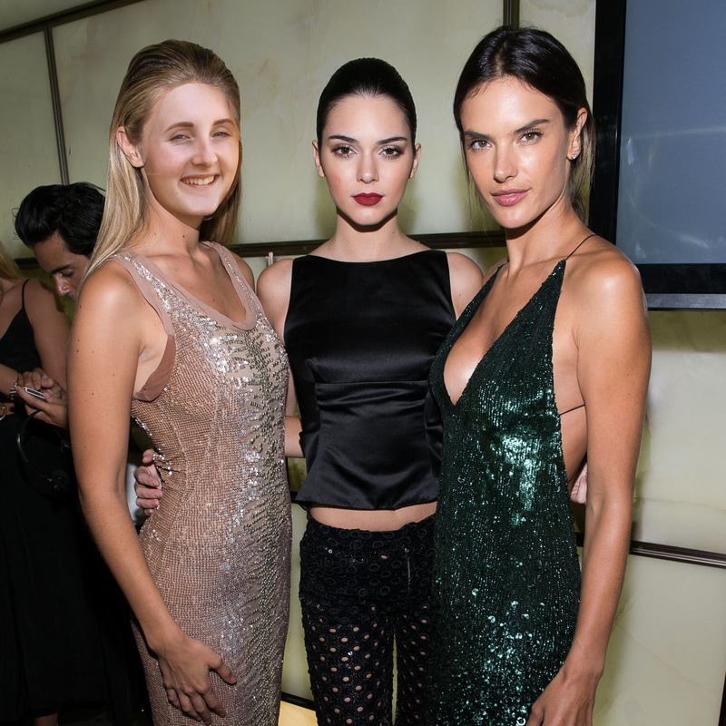 I used this photo of Gigi Hadid, Kendall Jenner, and another model because they are all very famous and really inspirational for young girls especially my age because they don't just promote their model figures, they support all typed of people. I have my own dreams of becoming an animal psychologist and an african animal ranger but I also would like to promote positive attitudes and to be supportive of not just others but yourself. They are amazing women in the fashion world and in my eyes they aren't just dumb models, they are my ultimate role models. How I did it:
-First I found an image on google, specifically a large one. -Then i found an image of myself that matched up with the person in the other photo. -Dragged the photo of myself out and used the lasso tool to cut out my face. -Then I dragged the photo of my face out to the other one and changed the opacity to about 60% -Then I used edit-transform-scale and make it the correct size. -And I also used edit-transform-rotate to line it up nicely with the photo underneath. -Then I made a layer mask by clicking on the little rectangle with the circle in it down in the lower right corner to create a layer mask. -Once I created the layer mask, I used the paintbrush tool with the color black to color over the places of my photo I did not need. -Once I lined it all up, I used image-adjustments-brightness/contrast to alter the brightness and contrast to help match the skin tone of the person in the other photo. -I also used image-adjustments-color balance to give the photo more of a yellow+red contrast to give in a more tan glow to the skin. -Then I went to layer-merg layers to merge them together and then saved it under Maddox-Sam-Layermask1/2.jpg 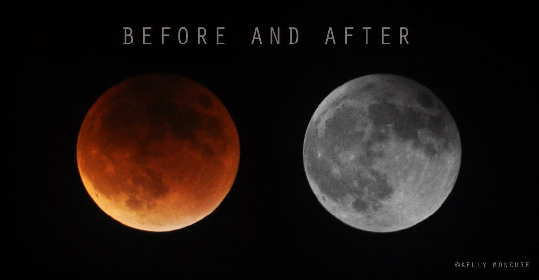 To photograph the moon:
1. Use a tripod! A flat surface will only allow you to shoot straight, and shooting the moon means that you'll be shooting up and constantly re-adjusting the tripod as the moon moves throughout the night. 2. Use a shutter release cord, remote or the camera's self timer if you don't have one, so that you don't move the camera when pressing the shutter release during a long exposure. 3. Use a zoom lens and zoom in as much as you can to the moon. It's okay if it's not a super fancy lens, this was shot using a 15 year old $100 lens. Focus in on the craters and details on the moon. 4. ISO 1250- 1600, so that you can use as fast a shutter speed as you can without losing detail-the longer the shutter speed, the more chances you have the camera will shake even slightly in the wind, resulting in an out of focus photograph. 5. Aperture priority of f/5.6 since you are not worried about capturing any details other then the moon. 6. Bracket your exposure, meaning over expose and underexpose the photograph from what the camera is telling you. Generally the camera will overexpose the moon, so you'll get nothing but a white blob in the sky. Use the exposure compensation button (the +/- button below the shutter release) and change the exposure to -0.5, then -1.0, then -1.5 and so on, until you start seeing detail in the moon. You may go as far as -5.0 exposure compensation to get what you need. 7. Take a fair amount of photos and keep refocusing as the night progresses. The photographs may look focused on the camera's display, but you won't really see if they're completely in focus until you upload them onto your computer screen.  ISO 400, aperture f/8, shutter speed 1/640 I took a photo of this longhorn for Balance because if split it down the middle, both sides of will be almost symmetrical and have balance representing the equality of both sides. I believe this photo is successful because it gives a good example of balance and equality on both sides of the photo if it was split down the middle. 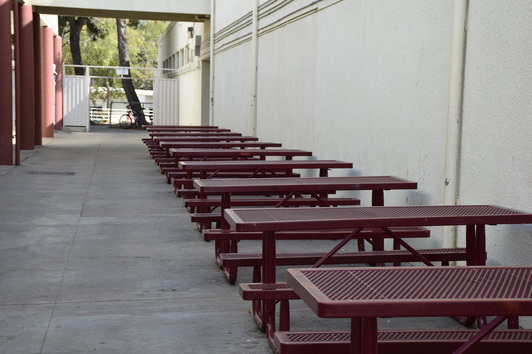 ISO 400, aperture f/8, shutter speed 1/400 I used this photo for Rhythm because the continuous line of tables has its own Rhythm of the same size and angle. They're all placed against the wall and all the same size going in the same direction. 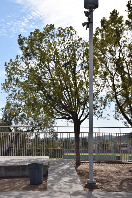 ISO 400, aperture f/8, shutter speed 1/2500 I took this photo of the trash can and the light pole for Proportion because it shows the huge difference in height and size. The trash can is short and wide, and the light pole is very tall and skinny. It really makes the difference between them in an obvious way. 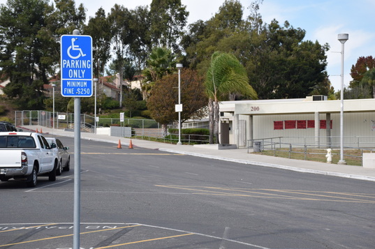 ISO 400, aperture f/9, shutter speed 1/640 I used this photo for Emphasis because the first thing you notice when you look at the photo is the handicap parking only sign because of it's bright blue color that really pops and attracts the eye. 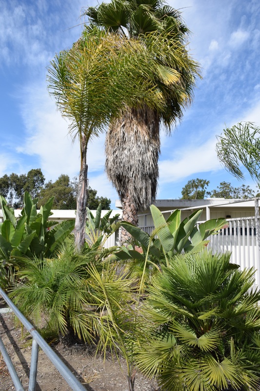 ISO 400, aperture f/8, shutter speed 1/800 I used this photo for Harmony because of all the different types of plants and how they're all a bright green color. all of their different shades of green give it a harmonious feeling and attract the viewers eyes. 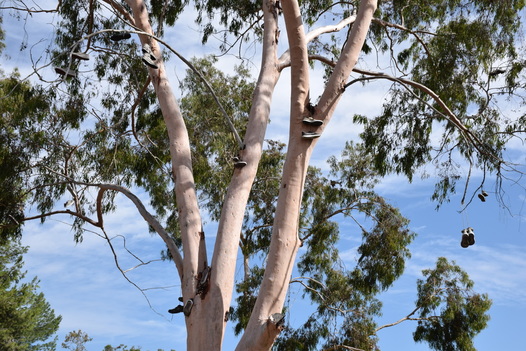 ISO 400, aperture f/8, shutter speed 1/800 I chose this photo for Variety because of all the different shoes hanging from the tree. They're all different types of shapes, colors, and sizes and show a variety of different types of people that threw them up there to hang from the tree. 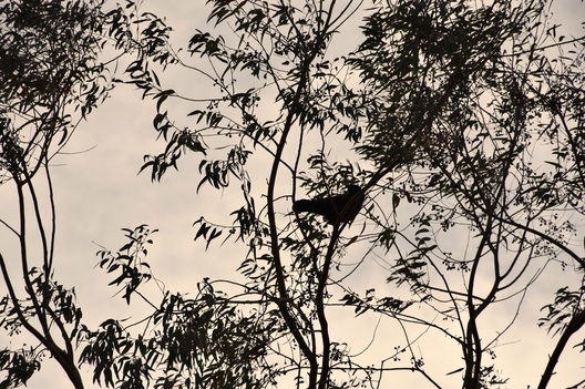 ISO 400, aperture f/8, shutter speed 1/2000 I chose this photo for Unity because of the cool shot of the bird sitting up on a branch in the tall tree with the gloomy clouds in the background making the photo almost look as though it's in black and white.
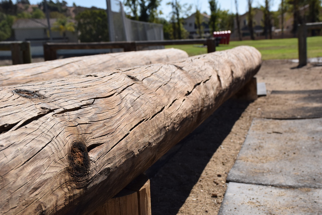 ISO 400, aperture f/8, shutter speed 1/1000 This Photo is of Line and it's out at the patch field with the long wooden logs. It's a good example of line because the log is a going out continuously in a straight line.  ISO 400, aperture f/8, shutter speed 1/1000 This photo is for Color because it really stands out in the photo and catches the viewers attention more than a normal photo that's black and white without color.  ISO 400, aperture f/8, shutter speed 1/1000 I used this photo for shape because it's a geometric shape with others also on the sign. I found this sign outside on the fence of the 800's by room 809 and i feel that it really goes well with Shape. 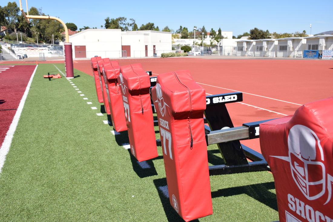 ISO 400, aperture f/8, shutter speed 1/1000 I used the Mod sleds for Form out in the stadium because they have a very odd shape that you don't see everyday. I originally was going to use this photo for line but I felt that it fit better with Form. 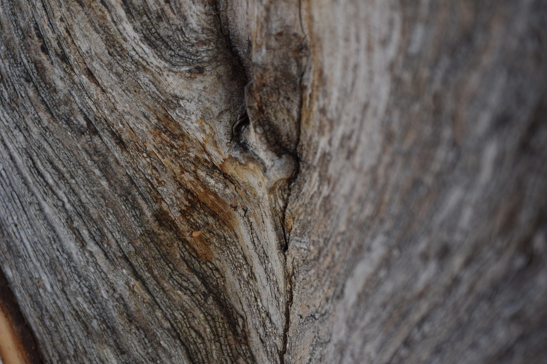 ISO 400, aperture f/8, shutter speed 1/1000 I used this photo for Texture because the texture of the bark from the tree just really stood out to me for this topic of the elements. It has a lot of different shades of grey and brown to make it obvious that it's the bark of a tree.  ISO 400, aperture f/8, shutter speed 1/1000 I used this photo for Space because of the large open space of the student parking lot. I stood at the front of the lot and looked out to the open space and thought it would be a perfect photo example of space. 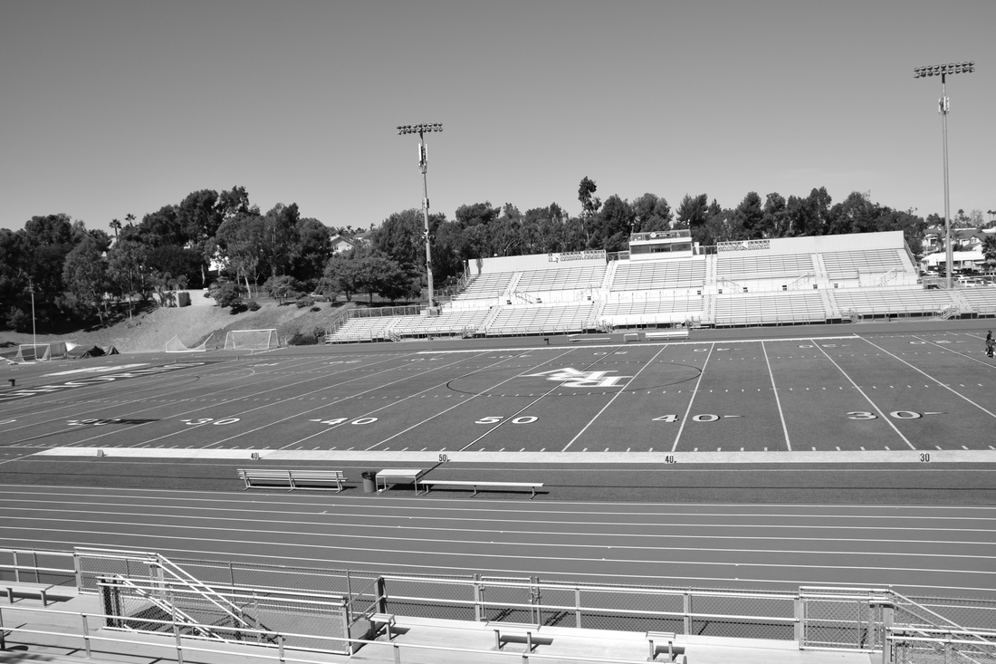 ISO 400, aperture f/8, shutter speed 1/1000 I used this photo for value because the difference of the black and white really stands out pretty well. They're lots of values of white, to grey, to black.
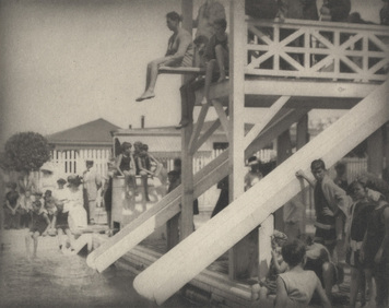 "The Pool"- Alfred Stieglitz 1910 Line: A line is one-dimensional and can vary in width, direction, and lengths. Lines can be horizontal, vertical, or diagonal, straight or curved, thick or thin. Lines lead your eye around the composition. It's a great example of line because of the large wood poles sticking out really grab the viewers attention.  "Landscape in Roses"- Sandy Skogland 2000 Color: three main characteristics: hue, value, intensity, warm, and cool. Furthermore, monochromatics are one color plus its tints and shades and Complimentary colors are colors opposite each other on the color wheel and Analogous colors are colors next to each other on the color wheel. 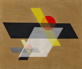 "A II (Construction A II)"- Laszlo Moholy-Nagy 1924 Shape: two dimensional, with a height and width. Organic shapes are shapes made by nature. Not completely defined and Inorganic shapes are man-made such as triangles and rectangles. 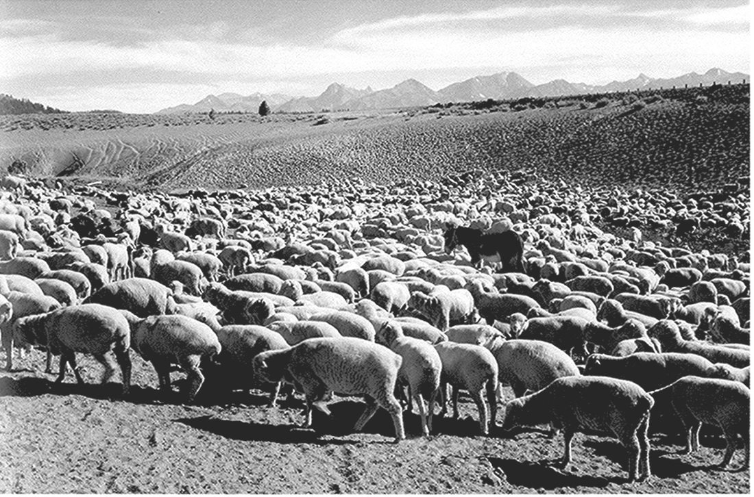 "Flock in Owens Valley"- Ansel Adams 1941 Form: three dimensional, has height and width and depth and photographers emphasize form by the use of highlights and shadows. 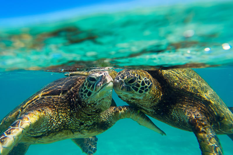 "Honu Kiss"- Clark Little 2016 Texture: The surface quality of an object that we sense through touch. All objects have a physical texture. In a two dimensional work, texture gives a visual sense of how an object depicted would feel in real life if touched. 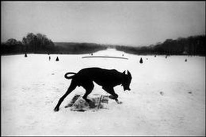 "Exiles"- Josef Koudelka 2008 Space: Real space is a three dimensional. Space in a work of art refers to a feeling of depth or three dimensions. It can also refer to an artist’s use of the area around the picture plane. Positive space is the space occupied by the primary object and Negative space is the space around the primary object. 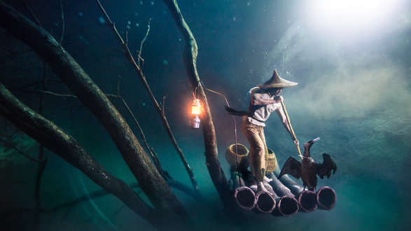 "Cormorant Fisherman"- Benjamin Von Wong Value: Value is the lightness or darkness of a surface. It is frequently used when talking about shading, but is also important in the study of color. Principles of Art
 Balance: Balance is similar to our physical sense of balance. It is how the artist uses opposing forces in a composition that results in visual stability. Most successful compositions achieve balance symmetrically or asymmetrically. 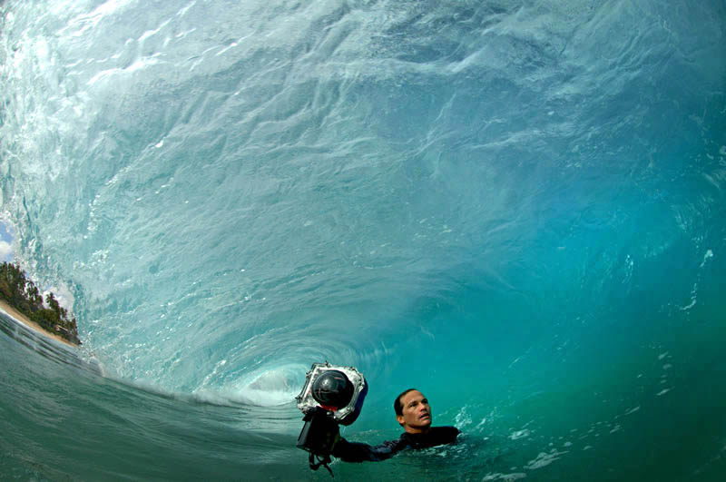 "Encounter With a Wave"- Clark Little Proportion: Relates to relative size and scale of the various elements in a design. Specifically, the relationship between the objects. Like in the photo, there's a huge wave towering over the small photographer. 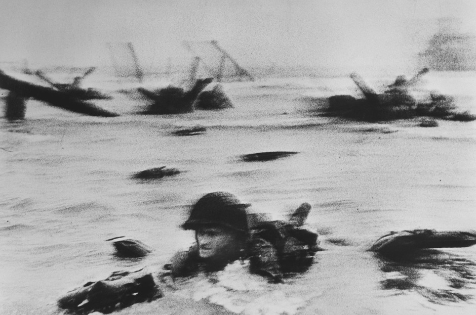 "American, b. Budapest"- Robert Capa 1913 Rhythm: Rhythm in an artwork indicates movement by the repetition of elements. Rhythm can make an artwork seem active. 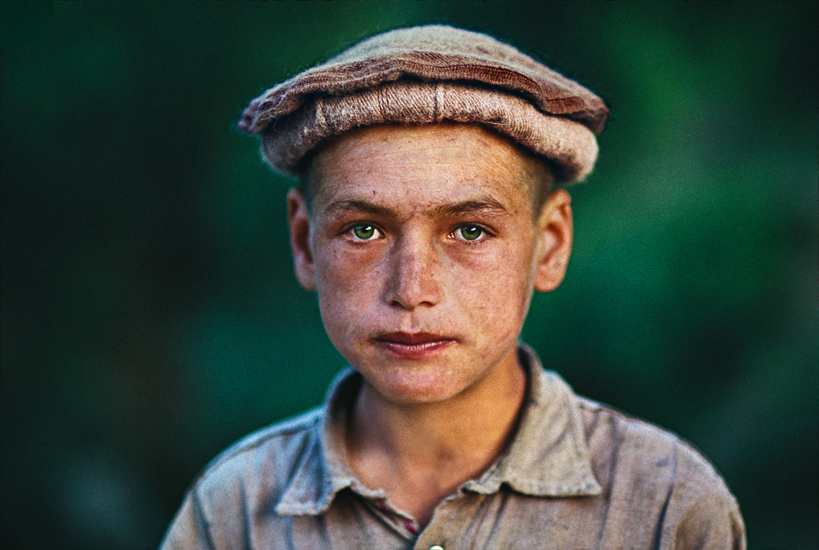 "Boy from Nuristan"- Steve Mccury 1992 Emphasis: Emphasis is to make one part of an artwork dominant over the other parts. It attracts the viewer’s eyes to a place of special importance in an artwork. 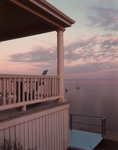 "Porch, Provincetown"- Joel Meyerwitz 1977 Harmony: Harmony is the pleasing quality achieved by different elements of a composition interacting to form a whole. Harmony is often accomplished through repetition of the same or similar characteristics 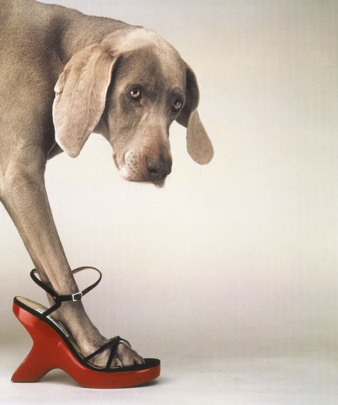 "Walk-a-thon" - William Wegman 1992 Variety: Differences achieved by opposing, contrasting, changing, elaborating, or diversifying elements in a composition to add individualism and interest. 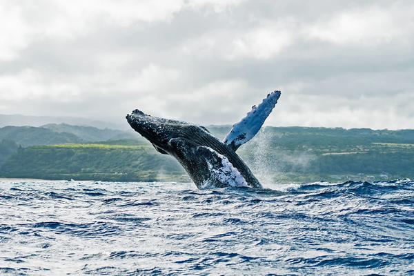 "Whale Breach"- Clark Little 2016 Unity: Unity is the result of bringing the elements of art into the appropriate ratio between harmony and variety to achieve a sense of oneness. It is the sense that everything works together and looks like it fits.
 ISO 1600, aperture f/8, shutter speed 1/1000
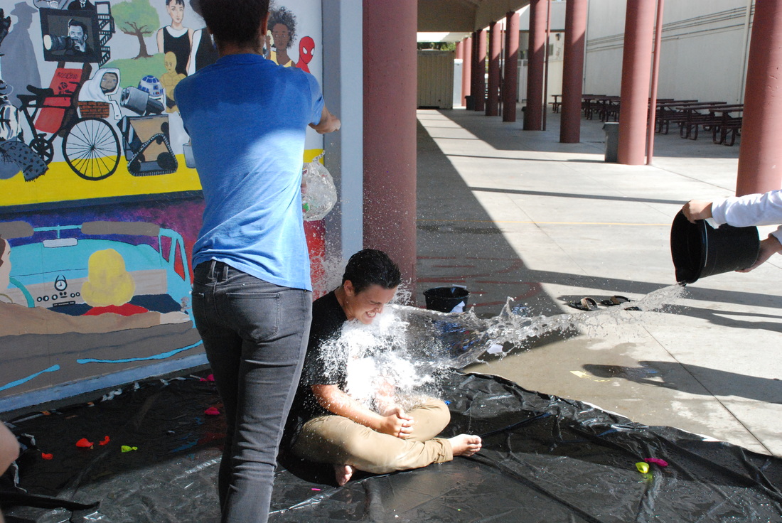 ISO 1600, aperture f/9.5, shutter speed 1/1000
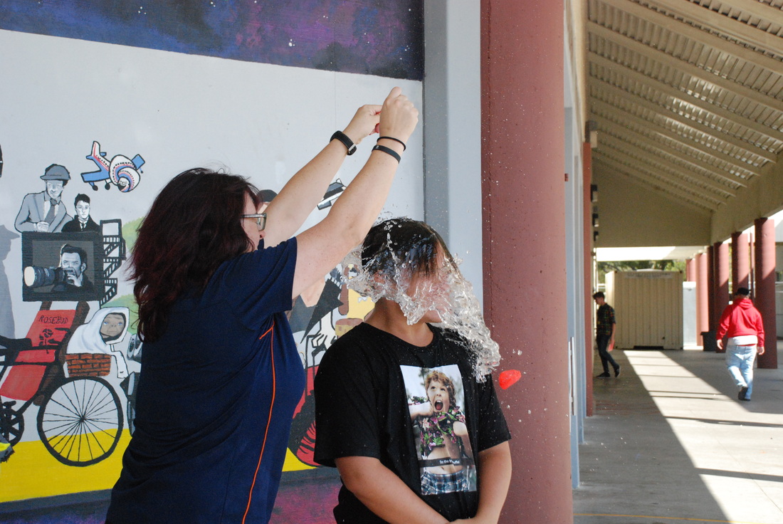
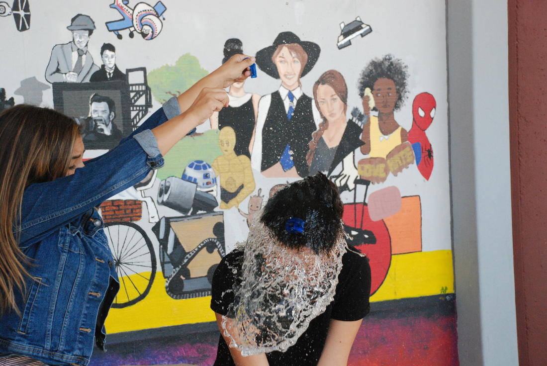
We used fast shutter speed to capture a fast photo of movement. One of the main struggles we had was when we were trying the card throwing and capturing a picture before they hit the ground and then we'd have to pick them back up. What I learned about fast shutter speed is that you really have to have good timing to capture that good photo. Something that I'd really like to use fast shutter speed for is when you go swimming out in the ocean and sort of do that cool hair flip thing, I'd really like to capture that in a photograph.
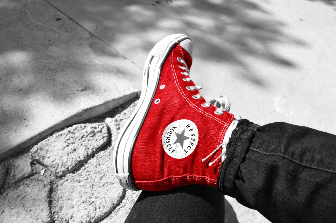 ISO 200, aperture f/14, shutter speed 1/200 My photograph is of my own foot that I took right away because I knew that I wanted to turn it red. I also put the RESPECT YOURSELF to support the topic and to show that I do respect myself as a person. I used Mrs. Moncure's method of the multiple layers and then changed the color balance in the background layer to red for my red object. I wanted the red shoe to represent the respect I have for others and that you should try and take a walk in other peoples shoes until you disrespect them for their differences.
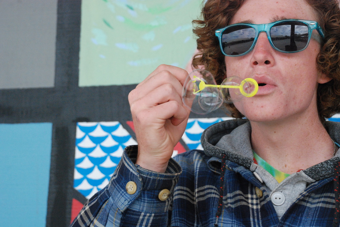
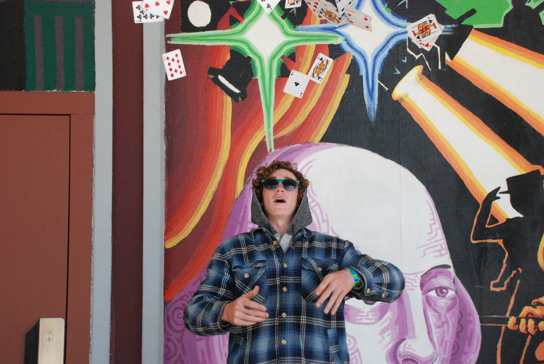
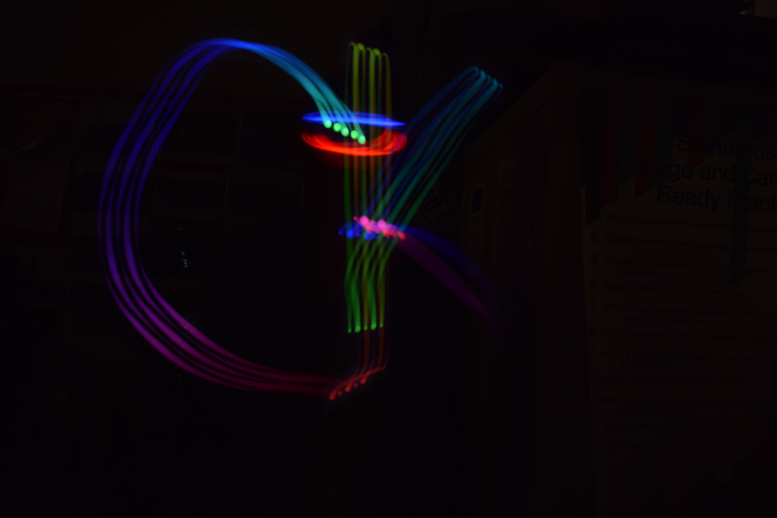
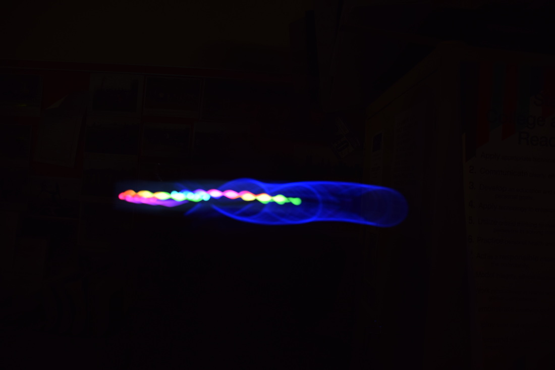
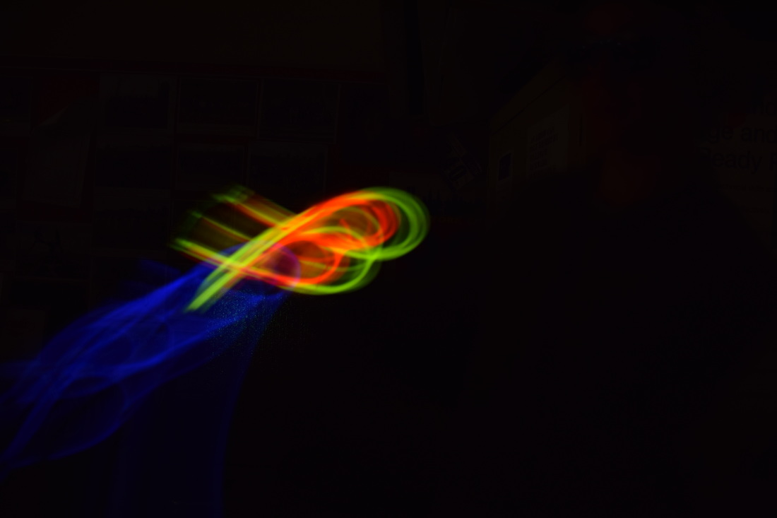
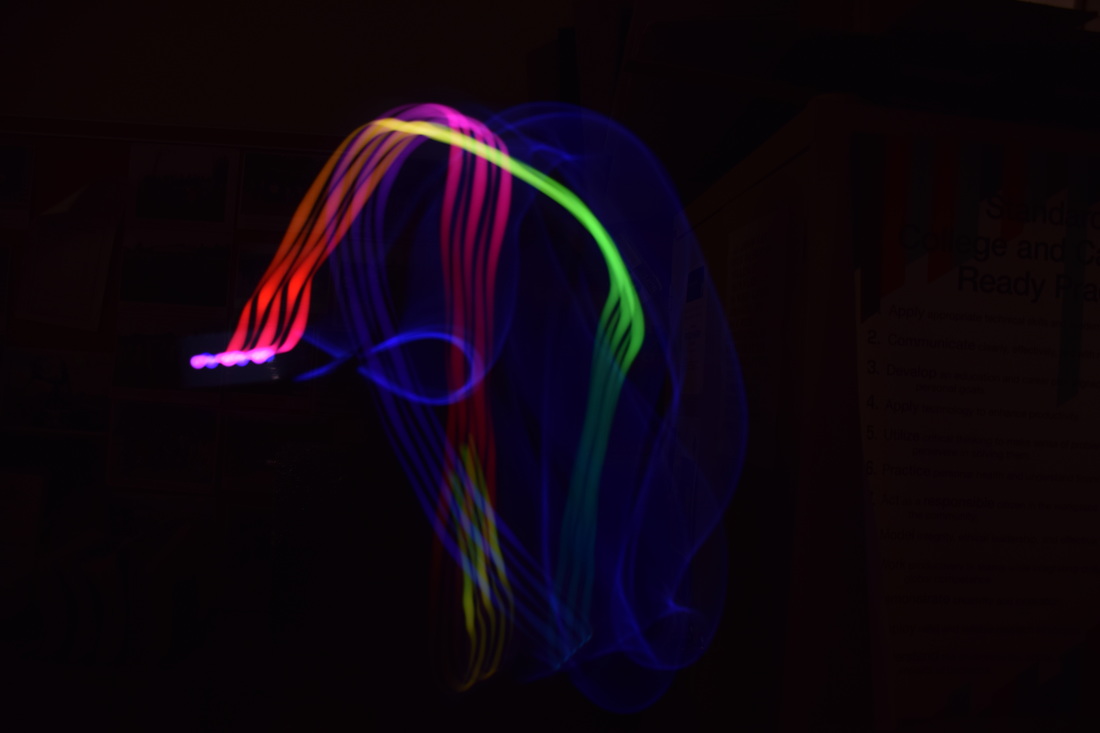
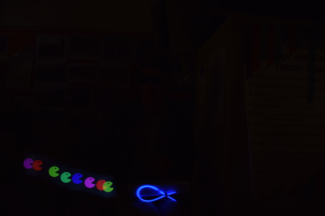
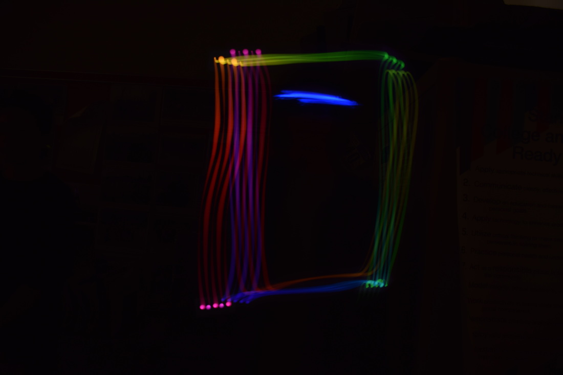
To take the light painting photos we had to use a tripod on the desk and have our partner face us with some form of light (glow stick, light painting app, etc.) In most of the photos I took, my partner used either a glow stick or the light painting app that I downloaded on to my iPhone. The only real struggle that we had was when Mrs. Moncure would flash the light, barely anything would show up in the photo. What I learned from the light painting was about the long photo exposure and how it really worked with helping the light show up in the photo.
|
AuthorArchives
May 2017
Categories |
 RSS Feed
